Thirty years of experience specializing in logo design,
brochures, catalogs, magazines and other printed material.
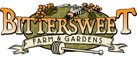
Created by assembling art pieces from four different source files. While compact at first glance, this logo has a surprising amount of depth to it as each aspect layers in front or behind, and sometimes both, with the elements around it.
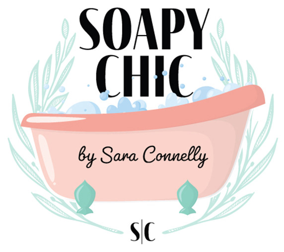
The client for this logo wanted something that was equal parts sophistication and whimsy. I chose a font that has a certain Parisian boutique feel and bracketed the logo with a classic laurel. The clawfoot tub adds class but in a way that isn’t stuffy. The bubbles rising up in front of the name added the whimsy she was looking for.
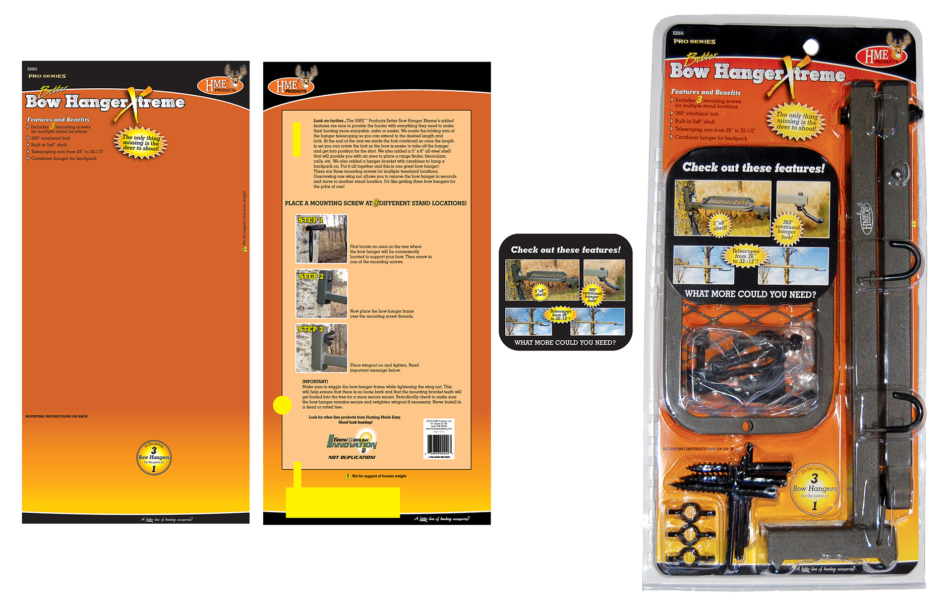
Over the course of ten years I did nearly 100 packaging layouts for a start-up company that made accessories for hunters. This is an example of just one. The files for the front and back (and in this case an insert) were created in Illustrator. The blocks of yellow on the back indicated where there would be a cutout in the card for the product to come through. Once approved by the client the final files were emailed to a supplier in Hong Kong for printing and assembly.
-
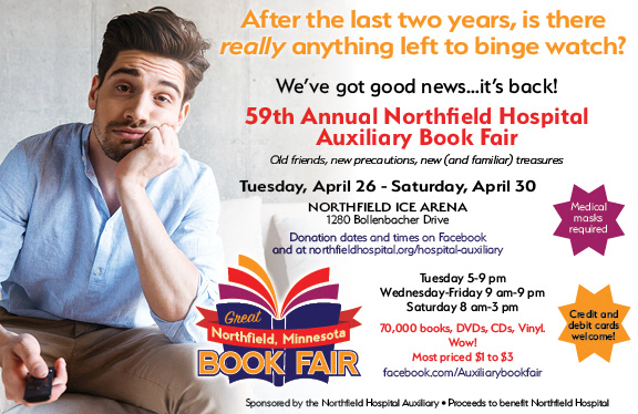
The vast amount of information presented in this print ad is actually well known to the followers of this event. So its return after a two-year absence due to the pandemic was the important part. The client gave me free rein to find imagery and create the headline. The pandemic really brought streaming TV to the forefront so it seemed like the perfect intersection to play off of for a book fair.
This ad saw life in print and online.
-
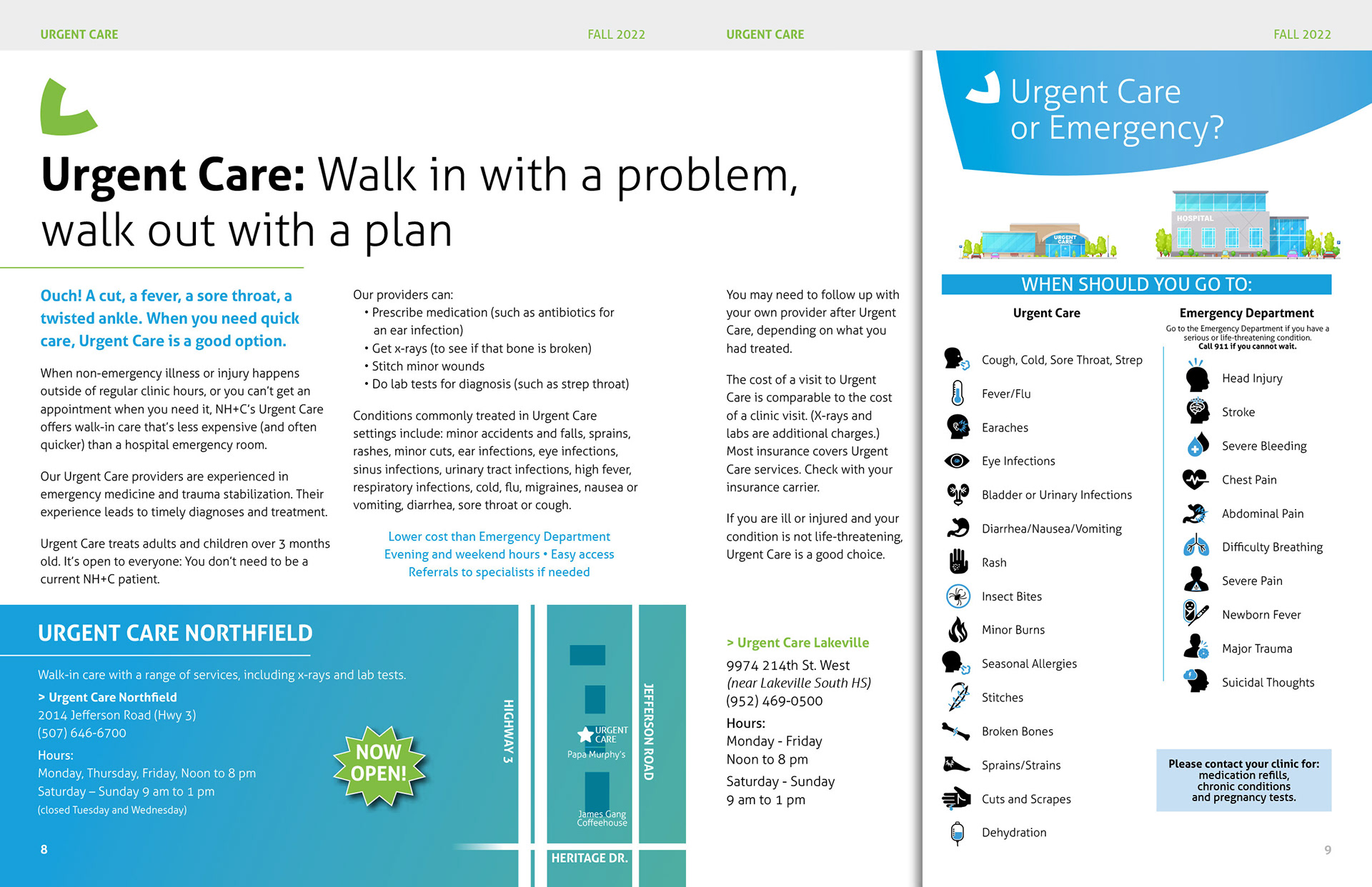
I’ve laid out this quarterly magazine piece for a decade and each edition brings new challenges. This particular two-page spread needed the editorial to flow well while providing space for two important side bars. Laid out in InDesign with a graphical assist from Illustrator, this spread went through multiple layouts before finding this final design.
-
This logo had several dozen iterations from start to finish. Eventually a simple 45° rotation of an octagon provided the drive to the finish line.
A local pumpkin and produce farm wanted to kick off a new phase in their existence with a new logo. The only instructions were to include pumpkins (duh) and something that resembled some of the structures on the farm.
-
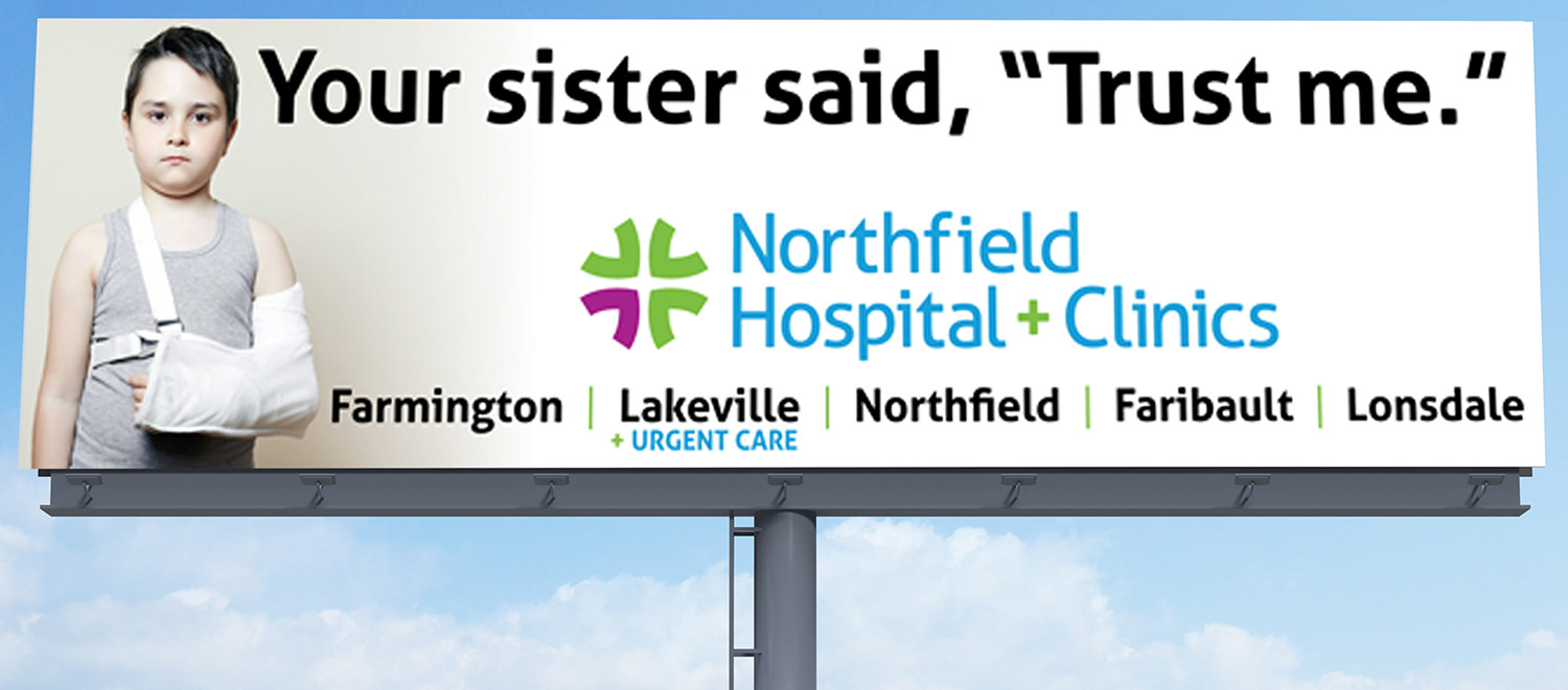
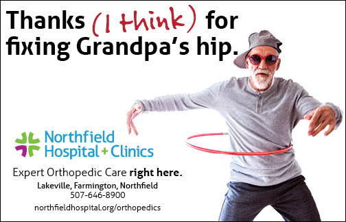
A billboard needs to get its message across almost literally in the blink of an eye. The client wanted to tout the vast array of nearby clinics available in the area in a semi-humorous way. A funny expression and a concise headline solves that. A large logo hammers home the client to those driving by. The list of area clinics may not be read the first time it’s seen but the billboard location in a heavy commuter area means it will be seen daily by thousands for the month this was up.